Making a comic
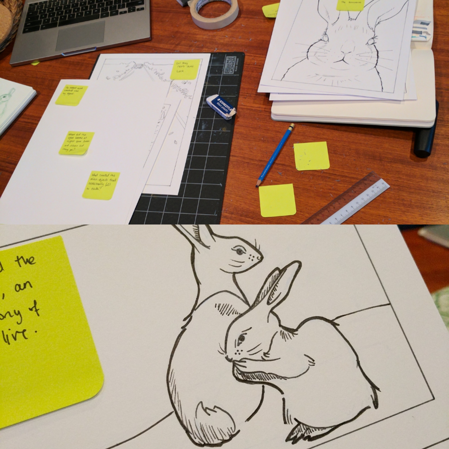
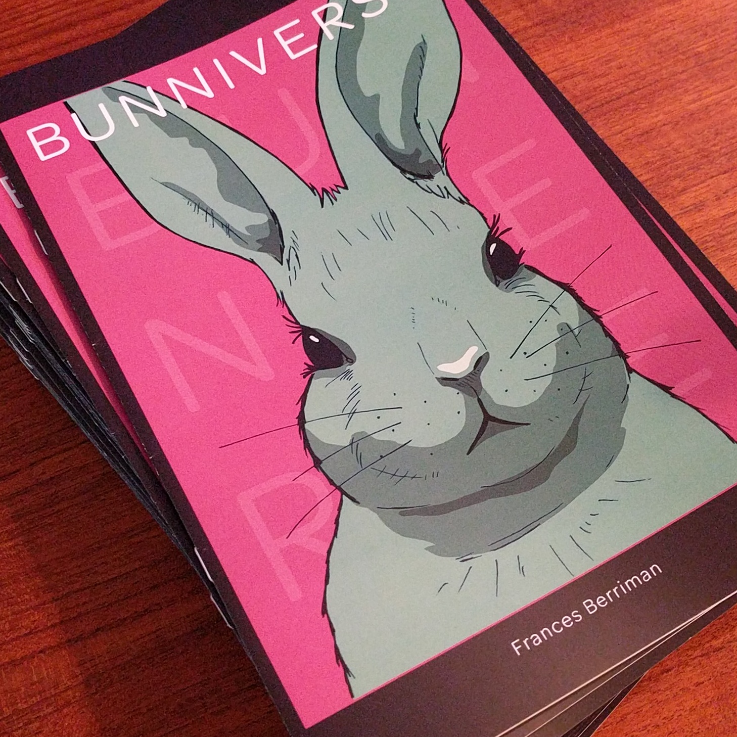
I made a comic for my dad's 60th birthday recently. It's the first time I've made a comic and the first time I've ever really dealt with making something in print. It was a lot more work than I expected, so I've got a whole new appreciation for comic book artists, inkers, colourists and writers. I basically learned a bunch of stuff that in hindsight should have been really obvious.


I screwed up:
- My margins. I just assumed that if I worked on Bristol board with an even margin on everything, I'd just be able to make it fit nicely when I scanned it and set the page. Of course, the physical paper size of Bristol board does not in fact match the aspect ratio of the classic printed comic book that I wanted to create. Thus, I have margins on the top and bottom of pages that are too large. Obviously.
- Where to focus my energy. I thought the colouring was going to be the bit that took forever. That, and cleaning up the line work and all that fiddly stuff. Turns out, Photoshop makes that stuff really fast if you just watch, like, 2 youtube videos and keep a simple palette (even then, I made some compositions overall too dark while others were too light). The bit that took me forever was figuring out what to actually put in the panels and then the physical act of hand drawing them. I should have applied what I'd learned from my actual career and lead with the user stories and got that bit down before worrying about the UI.
- The subject and style. Rabbits are basically expressionless blobs. They are terrible visual subjects for storytelling. I'd have had an easier time if I'd gone more cartoony and/or more fantastical.
- The story telling. I am not a writer. I do not know how to construct a story. I can barely string a blog post together. Comics are apparently 99% creative writing and creative writing is so, so hard.
